
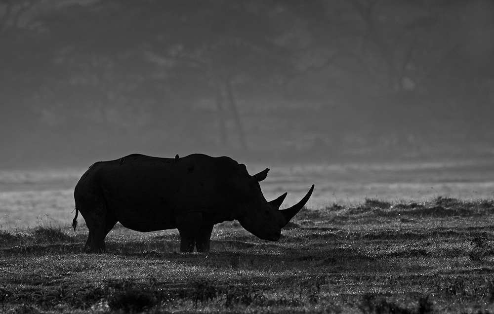
- White Rhino, Lake Nakuru, Kenya.
When can one impact more than 16 million?
I am referring to the colours that an average image can produce on a screen. Yes there are 16-bit, 24-bit, high resolution monitors etc. That is not what we want to explore today. one refers to a single tone i.e. B&W!
Before there was colour in our photographs, our world was depicted in Black & White or monochrome as it also called. Colour processing for the snap shooters and amateurs in India only came into existence around 1982 with the mushrooming of the One hour photo processing labs. Before which we were perfectly happy to see our world in B&W.
The art world has had colours for a very long time, some even dating back to the caveman paintings. Yet, pencil sketches, shadings, charcoal strokes and B&W artwork is still created.
So why does a B&W image still work when the world around us is draped in colours? Perhaps, it strips the image of colours which can be a distraction and render a scene in its most native form i.e in shapes, forms, lines, shades and that creates an emotional attachment of the viewer to the photograph. Is it not what we want? our viewer’s attention to linger on our photograph for that extra moment, to hold his or her interest. An average image will get a passing glance before the audience or judge flicks the page or moves to the next photograph. While the winner creates the interest that holds the attention of the audience or judge long enough for it to be special or award winning.
So when is the decision made to make a B&W image from a colour sensor? It depends. Sometimes, a scene itself begs to be created in B&W. Sometimes when sorting and classifying the tons of images after a photo shoot a particular frame can strike better in B&W. Either way an interesting image can be made.
In the first case, it is a deliberate and planned exercise which forces the photographer to identify tones, shapes, lighting and visualise the colourful scene in B&W. The same is true shooting film or digital. In the second case, a scene shot in colour could prompt the photographer to try out a B&W while post processing. No one method is greater than the other. What suits the photographer works.
In my earlier film days, I used to carry varying colour filters to create dramatic B&W images, Yellow filter for a little contrast and Red filter for more contrast. In today’s world of DSLR, I have a monochrome picture control setup as a custom in my camera which comes in handy when the scene needs to be captured in B&W. Most of the times, I will capture the image in colour with the intention of turning it into a B&W later. This is because of the numerous filter effects that Adobe photoshop offers while conversion from colour.
In the above photograph of a white Rhino in Lake Nakuru, I took the photograph in colour and the B&W conversion happened during the post processing and I must confess, the decision to go B&W happened during the review and not during the time of making the image. The underexposure of -2 EV was to create a dramatic effect of the backlight but a monochromatic scene was not the thought at the moment.
This was the first day in Africa and it was 20 mins after we entered the park. As with all first time sightings, I wanted a close up of a white rhino in soft morning light, a clear and crisp shot. The day started of with a light fog. We were on the shores of Lake Nakuru and it was natural for the fog. So the mental image I had will have to wait, the fog and the side light were throwing up interesting patterns. I was looking out for an individual rhino with a good horn, a rhino is more associated with the horn than it’s size and other features, wanting to highlight the form, I underexposed the scene to create a strong profile with the horn standing out, the side light a little towards the back and the fog created the magical separation needed to create a strong profile. Tell me if this works.
One thought! After your decision to create a B&W image, I recommend not to share the coloured original. For the frame in B&W, you as a photographer decided to showcase only starts a debate of whether the original coloured is better or the B&W is better.
On one occasion, I did share the original too and realised that this reduces the impact of the B&W shared earlier!
More of the journey in the following week. Happy Clicking!!